
I quite like the designs that use a mixture of text and imagery. I like the idea of using a image of a flower then putting text in or around the image.
This is one of my favourite ideas. I think this looks quite sophisticated and would look good on my website. I like how the text flows and lines up with the image.

I like this idea of using both a image of a camera and flower. It gives a very good simple/visual meaning.

This is a good idea, I like how the flower fits around the text.
 I like this idea too. Its good how the flower fits into the word 'flower' and would be good to use as a logo.
 Don't really like this design, there are better designs.
 I dont like this design it is not very clear, as it does not give of a clear message of what my website is about. It also wouldn't suit my target audience, as it needs to be more sophisticated.
 This is a good design too. It looks quite different from the other designs. It looks stylish, Sophisticated and classy.
 I don't really like this idea. Its not very tidy and wouldn't go with my website.
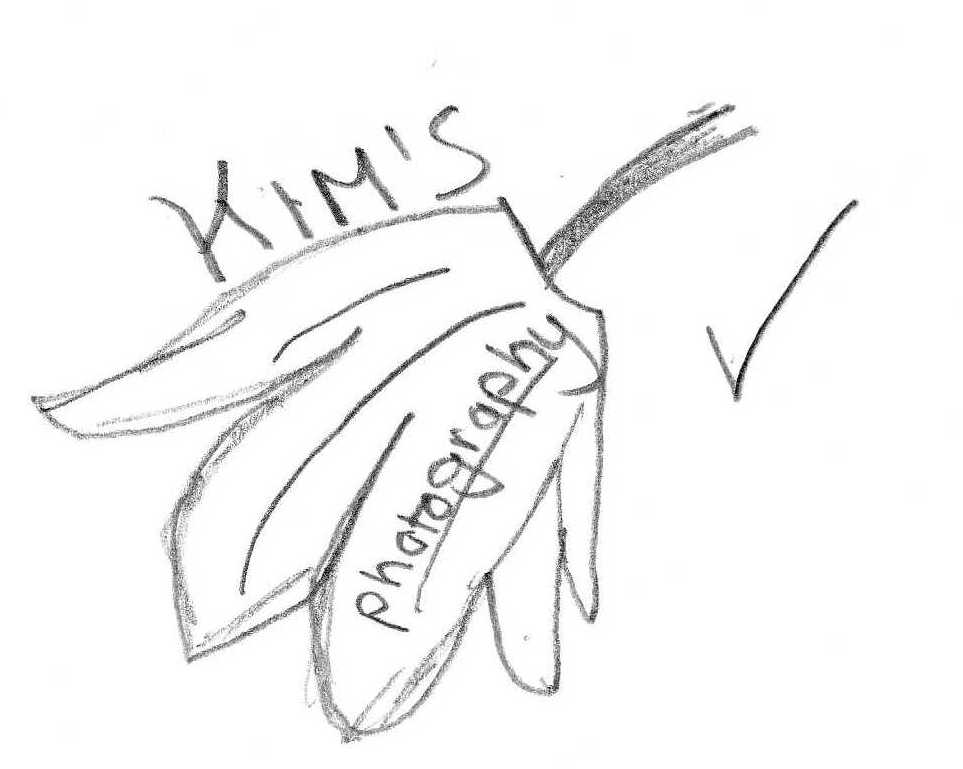
 I do not like this deign. The visual presentation does not look very good.
 I don't like this idea either. I think it looks a bit messy and there's to much there. A logo needs to be simple and needs to stand out.
 I quite like this logo. It is simple and it would stand out and it just states exactly what the website is about. However there is no visual images used, which would be better.